Wednesday 29 December 2010

Analysis of music magazine 3


Rolling Stones magazine has the typical conventions of a magazine.
There is a main image which is the main viewpoint of this magazine front cover. It is a mid-shot picture which therefore draws your attention straight too it. The main image could be classed as very controversial, but in this case suits the person as we see in the pop/music industry that lady Gaga is a very controversial person therefore this image suits the person she is. The main colour of the magazine is pink and purple which can therefore effect the audience which the magazine receives, as it is a colour which is associated with girls.
The masthead is the name of the magazine 'Rolling Stone' even though the main image is covering half of the masthead, we know what the magazine is as most the readers are subscribers to the magazine and if not it is recognisable as it is a very well known magazine.
The banner headline includes the image and the line 'The rise of Lady gaga' shows the story of why Lady Gaga is on the front cover and the story behind her, the headline draws the reader in as they want to find out what the full story is. By having a famous pop icon on the front of the magazine, it then determines the audience which the magazine receives, it would range from people who are monthly subscribers too people who are interested in Lady Gaga and interested in the story behind the front cover.
The layout of the magazine is very basic, the cover lines are beside the main image and therefore make the whole front cover easy to understand and easier to read.

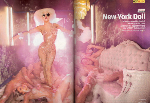
This is a double page spread which links in with the front cover of the rolling stone magazine. It is very simple and only contains a main 2 page image and a small amount of information. Although this is all it shows us, it is a very effective double page spread, as the main focus point is Lady Gaga we see her in her normal controversial image. She is covered in bubbles and has lack of clothing on, she is stood above the rest of the people in this image which shows her authority over everyone else there. Another connotation of this image could be that she is in the position which Jesus took on the cross, this could show her importance and as this is an iconic pose a lot of people can relate to it. The main colour of this page  is pink and purple which can therefore effect the audience which the magazine receives, as it is a colour which is associated with girls. Also by using these colours this page flows from the front cover as it is all the same colour and same theme. By using the headline 'New York Doll' it shows us how relevant and important Lady Gaga is that she is being referred to as a new york doll.

Wednesday 15 December 2010

Features of my music magazine

The features which I will include in my magazine are:

My music magazine titile/name:
Main picture
Depending on how simple or busy I want my front cover too be, ill use one picture or many related pictures.
The main headlines of which my magazine will consist of: The main news in the pop music industry at this time.
Coverlines - Upcoming events or important things.
Interviews with figures in the pop industry
Gossip, so and so has done....
Pop magazines include a lot of gossip and information about the peoples lives.
Competitions - Win tickets to.... Chance to meet....

Details which should be added on:
The issue number
Barcode


My main idea for the theme of my music magazine

My initial idea's for my music magazine are to make the genre, a genre which I am personally interested in. After many plans and idea's, I came to the conclusion that I would use the genre 'pop music'.

Pop music is sometimes looked past and to many people seen as a joke and the people within this are seen as talentless.

When choosing which music magazines to analysis I tried to focus on using pop related magazines or which showed figures which where classed as being within the genre of pop music. I mainly focused on the character 'Lady Gaga' as she is within the pop industry and is a very strong and influencing character within this.


When I think of pop music, I automatically think of boy bands and girl bands, these are two of the most stereotypical things which are included in pop music. Therefore I think that the main audience of the genre of pop music are, girls 9 - 17 this is the stereotypical age. But in my opinion I think that any age can like pop music, boys and girls of all ages.


There are many magazines which are currently in publication which support this genre. Some of these are: Smash hits, Q, NME, vibe and X factor magazine. These all include current pop issue's and show people who are influential to people who read these magazines.


Fonts

These are a few of the possible fonts which i would use on my front cover:

Music magazine

Music Magazine


Music Magazine


Music Magazine


Music Magazine 


I think that all these fonts would work on the front of my music magazine as they are all simple fonts with not much going on. In my opinion all these fonts would look better in black but after editing my pictures to how i want them, than I will decide what colour I think the font should be to suit my magazines theme.

Front cover mock ups

I made 2 mock up front covers to see which one would work best with the main image which I decided to use. I used boxes to represent where things would go on my final front cover for my music magazine.


I decide to use my 2nd front cover mock up as it worked better with my idea's. The text layout on the 2nd mock up fitted in well with my main image.

Mock up of contents page

mock up of double page spread

The X factor magazine has a very obvious genre of 'pop' this was a good magazine to use as my music magazine is that same genre. The majority of acts on X factor are focused on pop music, chart music and making it big in the industry of pop music.

Straight away the X factor logo has been used, this is something that the majority of people will recognise and because it is a very successful show, with over 14 million viewers a lot of people will be interested in this magazine and finding out backstage and exclusive gossip.

The layout of this front cover is very unorganised and everywhere but yet this layout works and is very effective. There are 6 main images and each of them has further information given to tell us as the reader what and why that image is on the front of this magazine. Also the images which are on the front cover are of people, acts and bands which are very much now and that have made an appearance or that are on the x factor.
There are also headlines which are linked with these pictures, some of these headlines are things such as 'Only in X mag' this shows the reader that these interviews, articles and photographs are exclusive to the x factor magazine and therefore the people who read it are getting an exclusive insight to information before a lot of other people. 'TAKE THAT, backstage at the show' and 'SHOCK EXIT, Aiden EXCLUSIVE' these headlines show how exclusive this information is and this therefore draws in the readers attention and makes them feel part of the magazine and part of the gossip, this also helps the magazine because drawing the reader in and including them in the magazine, sells the magazine.

The front cover of this magazine is very bright and colourful, these colours bring with them connotations of pop, a fun bright genre of music and therefore fun bright colours to represent that. The main colours are bright pink and bright yellow, this gives us the impression that the audience would be more suited towards girls as these are girly colours. Also the bands and acts on the front are famous boy bands and therefore stereotypically attract more girls attention. Also by using brighter colours it hes the magazine stand out more on the shelf, it brings more attention to that magazine as it is brighter and more attention grabbing.

I think because there is a lot going on on the front cover that the magazine seems more attractive and will make me want to buy it more, it shows that there is a lot of information in this magazine and will therefore be worth the money that you pay for it.

The x factor magazine is published by Fremantle media, who are a large global company.


The contents page of the X factor magazine is set out in a more simple way than the front cover, it is in columns and has headlines and then information under each headline This shows that the page is organised and therefore makes it easy for the reader to see what pages include which article. The contents page also links in with the front cover as there are some of the same bands and acts as there is on the front cover, this shows that these bands are an important feature to this issue of the magazine and will therefore have a bigger article and more important story.
The X factor logo is used again on this page, right at the start of the page to show who is representing this magazine.
'Its time to face' this headline is a very iconic catchphrase from the X factor show and is therefore known by a lot of people, by the magazine using this it shows that both the magazine and program are linked in with each other.
There are 5 pictures on this contents page which shows variety of the features in this magazine and gives the reader a lot of choice in just one page.
At the bottom of the page there are profile pictures of each act which was in the final, the pictures of acts which are now out the competition have been crossed out and as the weeks go by each issue will show an update of who is still in the competition, this is effective as it helps the reader to stay updated with the show.
There is a lot of colour used on the contents page, bright fun colours to stay with the connotations of pop music and to show a flow and consistency in the magazine.


This is a double page spread from the X factor magazine.
It is an article including Danni Minogue and one of her acts, Adien. The double page is set out in a very simple way, including 4 pictures, one main one of Danni and 3 little ones of her and Aiden on the program and columns of writing which is in question and answer form, this shows us straight away that this is an interview with Danni Minogue and is obviously being asked about her act Aiden, this is shown as the headline is 'Aiden's hilarious but how could i get that across?' this also shows us straight away what the interview will be about.
The colours on this double page spread are very neutral and calming, it almost makes this article easier to read as there is nothing that stands out more than anything else and there is nothing which will distract your attention from what you are reading.

Initial idea's for my music magazine

My initial idea's for my music magazine are to make the genre, a genre which I am personally interested in. After many plans and idea's, I came to the conclusion that I would use the genre 'pop music'.

Pop music is sometimes looked past and to many people seen as a joke and the people within this are seen as talentless.

When choosing which music magazines to analysis I tried to focus on using pop related magazines or which showed figures which where classed as being within the genre of pop music. I mainly focused on the character 'Lady Gaga' as she is within the pop industry and is a very strong and influencing character within this.


When I think of pop music, I automatically think of boy bands and girl bands, these are two of the most stereotypical things which are included in pop music. Therefore I think that the main audience of the genre of pop music are, girls 9 - 17 this is the stereotypical age. But in my opinion I think that any age can like pop music, boys and girls of all ages.


There are many magazines which are currently in publication which support this genre. Some of these are: Smash hits, Q, NME, vibe and X factor magazine. These all include current pop issue's and show people who are influential to people who read these magazines.

Wednesday 17 November 2010

Analysis of music magazine front cover 1


Q magazine follows the typical conventions of a magazine. It has the main conventions which therefore help to sell the magazine.

'Q' magazine there is a main image which is centered in the middle, a mid-shot picture which automatically draws your eyes straight to it. The banner headline includes the image and the line 'Has Risen' shows the story of why Lady Gaga is on the front cover and the story behind her, by using the short phrase 'Has risen' it draws the reader in as they want to find out what the full story is. There is a main masthead which tells the reader who one of the main viewpoints of the magazine is, in this case 'Lady Gaga'. By using a pop icon such as Lady Gaga this shows the genre of the magazine, is pop. The main image could be classed as very controversial, but in this case suits the person as we see in the pop/music industry that lady Gaga is a very controversial person therefore this image suits the person she is. Also the 'A' letter of the text is covered by her body and the letter 'G' is over lapping her body this shows dominance and that she is a bold character but as the 'G' is over lapping her this shows that she can be very venerable and let characters take over her. This is also reflected in the clothes which she is wearing, as she is wearing black leather and black leather gloves, this type of clothing can sometimes be seen as a representation of dominance, also as she is topless this shows venerability but is represented in a bold confident way, as the image is sexy and she is portrayed to be comfy in the image and also possesses power and control over the situation she is in. Also by using Lady Gaga, it shows that the magazine is popular as hey are using very iconic people who are loved by many and are at the top of the music industry to represent their
magazine.
The target audience of 'Q' magazine is any ages and any gender, I think that it would be more suited towards 13-40 year olds which are interested in the music industry and that are particularly interested in music acts and the happenings of the month. I think that most of the audience will be subscribers to this magazine as it is a very popular well represented magazine.  I think the more audience that they receive depends on the person or people that are on the front cover, if people like the icon on the front they are more likely to buy this magazine as a one off.
 The colours of this image and front cover are very basic, the only colour which stands out is red and this is the colour that represents 'Q' magazine, this is a dominant colour which can also represent passion, which I think is important as 'Q' is a music magazine and will therefor appeal to people who are passionate about music and the musical industry.
There is a main masthead on the top of the magazine which features on every single monthly copy 'THE UK'S BIGGEST MUSIC MAGAZINE' this shows the reputation of the magazine and will therefore make the reader feel more confident too buy this as it has been said to be the best UK music magazine. 
The cover lines of the magazine are surrounding the image, there down the left and side and the right they are the main cover lines are in bold plain font to stand out from the rest. 
Also there is a main cover line which is situated in the top right hand corner, '100 most shocking moments in music' this is a particularly important cover line, the word '100' and 'shocking' are in red to make these words stand out to the target audience.


This is a double page spread from Q magazine, it doesn't match my front cover as I couldn't find an article to match. The genre of this article is within my chosen genre of 'pop music'.
The main imagine is Shakira working in a studio, this shows a positive image as she is showing the work side of her career and that being famous and a singer is not all about glamour and fame. The main image shows her in casual clothes, she is not all glamed up and she is looking very comfortable in her surroundings. There is also another picture on the double page spread, one of her from her she wolf video, her hand is round her body in a claw shape, this portrays the image of a wolf and therefore links in with her song and video.

The double page spread is about Shakira and her work and there are also parts where they are interviewing and including Shakira's opinions. The headlines on these pages are a real attention grabber's, 'Danger! Shakira at work' I think this shows that she is a very successful women and that she is set on achieving her goals. I think the connotations of the word danger show that she is a women to be feared and that she is a very career driven and successful.


This is a contents page from Q magazine. It is set out in a very simple typical way, there is a main image of a band to show one article and then a smaller one showing a different article this shows a variety of what is included in the magazine, rather than just having one main picture and one main focus. The main image is of 'The Courteeners' a successful band and a popular band, this is reflected in the location of this photograph, they are on top of somewhere high so this could have connotation of them being above other people in the music industry. Next to the main image Q have listed the features which will appear in this magazine, this is typical of a contents page and is just set out in a list to make it easy for the reader to choose what they want to read and be able to get to that page easy. The whole page is set out in boxes and columns to make it easy and simple for us to understand and follow.
The colour and font used on this page is very basic, theres no colour that really stands out and draws your attention, therefore you look and take in the whole page before anything catches your attention and you turn to that page already. The text is very simple, it has a sophisticated feel to it as well as it being easy to read.
'Every Month' this makes it obvious to us that this magazine has an issue every month, is also shows us that this magazine has been published for a long time. It also shows that articles and features have become popular to this certain audience so have been put in the magazine more often.  

Wednesday 10 November 2010

Brief

Main task: the front page, contents and double page spread of a new music magazine. All images and text used must be original, produced by you - minimum of four images.

Friday 22 October 2010

Mind map of my idea's

Evaluation of College Magazine

For my preliminary exercise we had to create a front cover of a college magazine and also a mock up of the contents page. I used one main image on my front page to make my front cover simple yet effective. I used a picture of an activity which took part in college(dance) to show college life and the things which can be done during. I challeneged the brief as I didnt think a mid-shot image would show the full potentional of my idea of the dancers, I used a much larger area for my image as I thought it would make my image and final idea look so much better and therefore be more effective on an overall scale. I also used a masthead and coverlines to show whats happening in Wyke College. I used basic colours to create a simple final image and black and white headlines and coverlines to create a sophisticated simple look which is still very effective.
My magazine cover is aimed at an audience of students, 16-19 year olds who attend the college and also teachers and tutors and anyone who is involved with the college or generally interested.
I produced my media piece in the way I did as I thought it would be an effective idea. I also thought the image portrayed a positive happy image of the college as the characters i used in my image looked happy as they where enjoying the activity that they was taking part in.
Overall i thought my final front page of my college magazine 'Wyke College' was very effective as it portrayed a good image of the college i was representing in my media piece. I used subtle colours which then reflected the sophistication of my image and text and then made my overall final piece look a lot better.

Final college magazine front cover

Wyke College magazine front cover

LIIAR analysis of a college magazine

This College magazine front cover. It is a very simple image but creates a positive effect of the college.
The masthead on this text really stands out as it is bold and a large font. this makes the text stand out more and then our attention is drawn straight towards this and therefore tells us what the magazine is about. The front cover of this magazine contains a main picture of the college grounds, this pictures portrays the image of a very wealthy college as there is a wealthy building, we see this as the building has pillars and very intricate detail. The front cover contains a basic colour scheme of greens, which represents a calm, formal setting. The front cover also includes a small amount of information which then encourages the reader to read more into the magazine. This front cover is very organised and set out in a simple manner, this is too make the page look effective yet simple and attract more attention as its easier to understand and read.

The institutions of this magazine is colleges, it shows a typical higher class college and tells us the main things which are happening there. The audience of this magazine would be people aged 16-19 or college teachers, tutors or anyone who is involved with a college or is interested in college life and colleges in general. The magazine is aimed at both genders as it hasnt got any specific colours or images to show us that it is aimed at one gender. This is effective as it is based on more open minded and no stereotyping issue's or spliting up genders and therefore portraying the fact that both genders, male and female are equal in everyday life and more importantly, college life and education. The text shows possitive connotations of college, is shows a creative side of college and a possitive image of college.

Mock up of contenst page

This is a mock up of a contents page which would be incorporated into my final magazine if I were too publish a full magazine.  I used boxes which showed where different things would be a final contents page would be made.

Wednesday 13 October 2010

LIIAR analysis of college magazine

This is a College issue which was published in 'The New york Times Magazine.' This magazine front cover is very effective as it is made up of many different materials in which students have produced.

The masthead on this magazine really stands out, as it is in the middle of the page and therefore your attention is drawn straight to that and informing you what the magazine is about straight away. The front cover contains a large amount of colour which makes the page more involved and therefore stand out more. The page is made up of small pieces of work, pictures and writing in which the students have produced. This makes the front cover seem more like a college magazine, as the students have actually taken part in the making of this issue. This text is very organised and involved but is also very busy and complicated, there is a lot going on but it is used to great effect. Overall I think this front page is effective and tells us what its about straight away. I think this is very important for a front cover as the masthead introduces us straight to the issue.

The institution of this magazine is colleges, as we have only seen the front cover we don't know whether it is focused on one college or an overall view on many colleges. I think the ideology of this magazine is to show the work of students and draw attention to colleges, as we are not given much information or main pictures on the front page the text is not given one specific issue. The audience of this magazine would be people aged 16-19 or college teachers, tutors or anyone who is involved with a college or is interested in college life and colleges in general. The magazine is aimed at both genders as it hasnt got any specific colours or images to show us that it is aimed at one gender. This is effective as it is based on more open minded and no stereotyping issue's or spliting up genders and therefore portraying the fact that both genders, male and female are equal in everyday life and more importantly, college life and education. The text shows possitive connotations of college, is shows a creative side of college and a possitive image of college.


Conventions of a magazine front cover

Thursday 7 October 2010

LIIAR interpretation of the brief.

L - Language. How the text is put together and the terminolgy which is used, e.g Masthead, headline.
I - Institution. Producer of the media text and why they did it.
I - Ideology. System of ideas and beliefs within the media text.
A - Audience. The specific audience in which a media text is aimed at and how we can tell this.
R - Representaion. Who/what/where is represented? How are these things portrayed?

Thursday 30 September 2010

AS media Foundation Porfolio Brief

Preliminary exercise: using DTP and an image manipulation program, produce the front page of a new school/college magazine, featuring a photograph of a student in medium close-up plus some appropriately laid-out text and masthead. Additionally you must produce a mock-up of the layout of the contents page to demonstrate their grasp of DTP.

Main task: the front page, contents and double page spread of a new music magazine. All images and text used must be original, produced by you - minimum of four images.