 The X factor magazine has a very obvious genre of 'pop' this was a good magazine to use as my music magazine is that same genre. The majority of acts on X factor are focused on pop music, chart music and making it big in the industry of pop music.
 Straight away the X factor logo has been used, this is something that the majority of people will recognise and because it is a very successful show, with over 14 million viewers a lot of people will be interested in this magazine and finding out backstage and exclusive gossip.
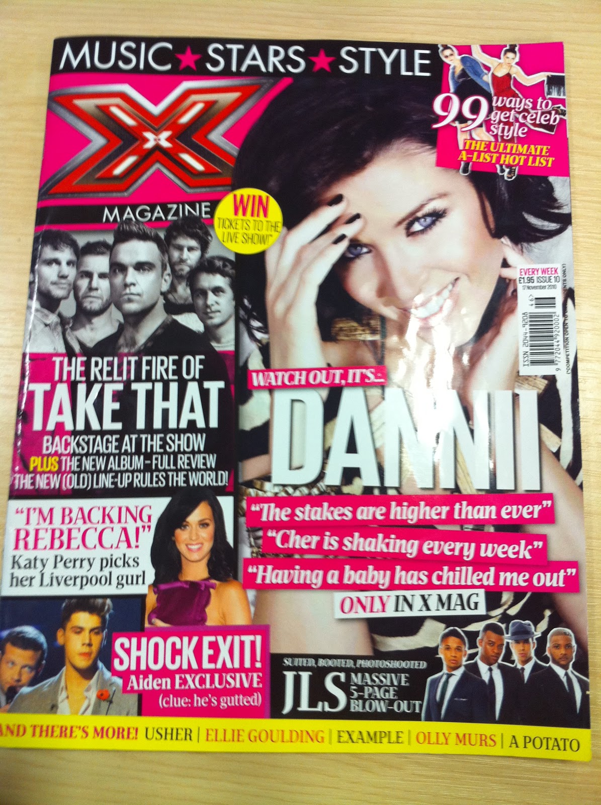
The layout of this front cover is very unorganised and everywhere but yet this layout works and is very effective. There are 6 main images and each of them has further information given to tell us as the reader what and why that image is on the front of this magazine. Also the images which are on the front cover are of people, acts and bands which are very much now and that have made an appearance or that are on the x factor.
There are also headlines which are linked with these pictures, some of these headlines are things such as 'Only in X mag' this shows the reader that these interviews, articles and photographs are exclusive to the x factor magazine and therefore the people who read it are getting an exclusive insight to information before a lot of other people. 'TAKE THAT, backstage at the show' and 'SHOCK EXIT, Aiden EXCLUSIVE' these headlines show how exclusive this information is and this therefore draws in the readers attention and makes them feel part of the magazine and part of the gossip, this also helps the magazine because drawing the reader in and including them in the magazine, sells the magazine.
The front cover of this magazine is very bright and colourful, these colours bring with them connotations of pop, a fun bright genre of music and therefore fun bright colours to represent that. The main colours are bright pink and bright yellow, this gives us the impression that the audience would be more suited towards girls as these are girly colours. Also the bands and acts on the front are famous boy bands and therefore stereotypically attract more girls attention. Also by using brighter colours it hes the magazine stand out more on the shelf, it brings more attention to that magazine as it is brighter and more attention grabbing.
I think because there is a lot going on on the front cover that the magazine seems more attractive and will make me want to buy it more, it shows that there is a lot of information in this magazine and will therefore be worth the money that you pay for it.
The x factor magazine is published by Fremantle media, who are a large global company.

The contents page of the X factor magazine is set out in a more simple way than the front cover, it is in columns and has headlines and then information under each headline This shows that the page is organised and therefore makes it easy for the reader to see what pages include which article. The contents page also links in with the front cover as there are some of the same bands and acts as there is on the front cover, this shows that these bands are an important feature to this issue of the magazine and will therefore have a bigger article and more important story.
The X factor logo is used again on this page, right at the start of the page to show who is representing this magazine.
'Its time to face' this headline is a very iconic catchphrase from the X factor show and is therefore known by a lot of people, by the magazine using this it shows that both the magazine and program are linked in with each other.
There are 5 pictures on this contents page which shows variety of the features in this magazine and gives the reader a lot of choice in just one page.
At the bottom of the page there are profile pictures of each act which was in the final, the pictures of acts which are now out the competition have been crossed out and as the weeks go by each issue will show an update of who is still in the competition, this is effective as it helps the reader to stay updated with the show.
There is a lot of colour used on the contents page, bright fun colours to stay with the connotations of pop music and to show a flow and consistency in the magazine.
 This is a double page spread from the X factor magazine.
 It is an article including Danni Minogue and one of her acts, Adien. The double page is set out in a very simple way, including 4 pictures, one main one of Danni and 3 little ones of her and Aiden on the program and columns of writing which is in question and answer form, this shows us straight away that this is an interview with Danni Minogue and is obviously being asked about her act Aiden, this is shown as the headline is 'Aiden's hilarious but how could i get that across?' this also shows us straight away what the interview will be about.
The colours on this double page spread are very neutral and calming, it almost makes this article easier to read as there is nothing that stands out more than anything else and there is nothing which will distract your attention from what you are reading.
No comments:
Post a Comment