These are a few of the possible fonts which i would use on my front cover:
Music magazine
Music Magazine
Music Magazine
Music Magazine
Music Magazine
I think that all these fonts would work on the front of my music magazine as they are all simple fonts with not much going on. In my opinion all these fonts would look better in black but after editing my pictures to how i want them, than I will decide what colour I think the font should be to suit my magazines theme.
Wednesday, 15 December 2010
Front cover mock ups

 I made 2 mock up front covers to see which one would work best with the main image which I decided to use. I used boxes to represent where things would go on my final front cover for my music magazine.
 I decide to use my 2nd front cover mock up as it worked better with my idea's. The text layout on the 2nd mock up fitted in well with my main image.


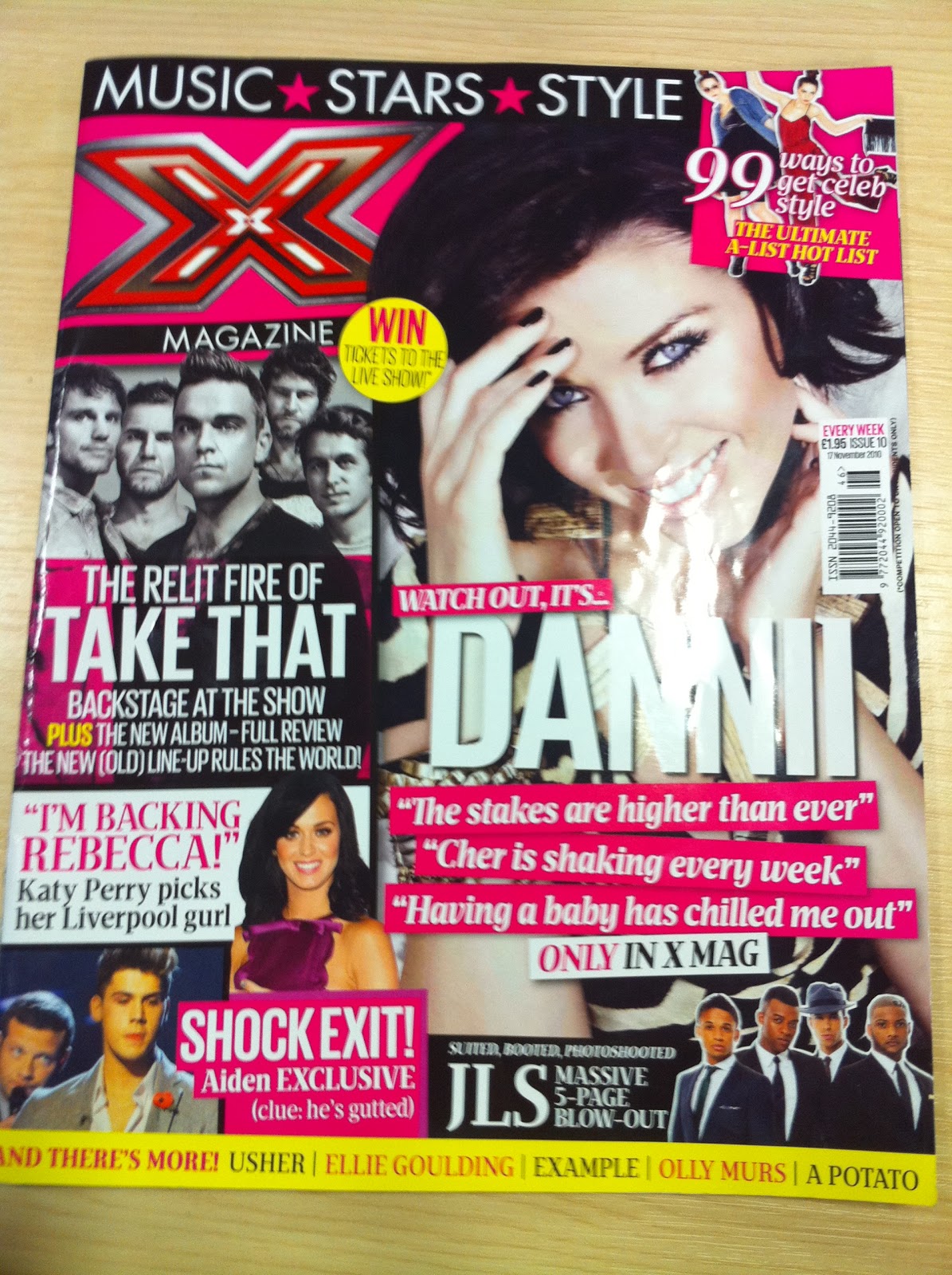 The X factor magazine has a very obvious genre of 'pop' this was a good magazine to use as my music magazine is that same genre. The majority of acts on X factor are focused on pop music, chart music and making it big in the industry of pop music.
 Straight away the X factor logo has been used, this is something that the majority of people will recognise and because it is a very successful show, with over 14 million viewers a lot of people will be interested in this magazine and finding out backstage and exclusive gossip.
The layout of this front cover is very unorganised and everywhere but yet this layout works and is very effective. There are 6 main images and each of them has further information given to tell us as the reader what and why that image is on the front of this magazine. Also the images which are on the front cover are of people, acts and bands which are very much now and that have made an appearance or that are on the x factor.
There are also headlines which are linked with these pictures, some of these headlines are things such as 'Only in X mag' this shows the reader that these interviews, articles and photographs are exclusive to the x factor magazine and therefore the people who read it are getting an exclusive insight to information before a lot of other people. 'TAKE THAT, backstage at the show' and 'SHOCK EXIT, Aiden EXCLUSIVE' these headlines show how exclusive this information is and this therefore draws in the readers attention and makes them feel part of the magazine and part of the gossip, this also helps the magazine because drawing the reader in and including them in the magazine, sells the magazine.
The front cover of this magazine is very bright and colourful, these colours bring with them connotations of pop, a fun bright genre of music and therefore fun bright colours to represent that. The main colours are bright pink and bright yellow, this gives us the impression that the audience would be more suited towards girls as these are girly colours. Also the bands and acts on the front are famous boy bands and therefore stereotypically attract more girls attention. Also by using brighter colours it hes the magazine stand out more on the shelf, it brings more attention to that magazine as it is brighter and more attention grabbing.
I think because there is a lot going on on the front cover that the magazine seems more attractive and will make me want to buy it more, it shows that there is a lot of information in this magazine and will therefore be worth the money that you pay for it.
The x factor magazine is published by Fremantle media, who are a large global company.

The contents page of the X factor magazine is set out in a more simple way than the front cover, it is in columns and has headlines and then information under each headline This shows that the page is organised and therefore makes it easy for the reader to see what pages include which article. The contents page also links in with the front cover as there are some of the same bands and acts as there is on the front cover, this shows that these bands are an important feature to this issue of the magazine and will therefore have a bigger article and more important story.
The X factor logo is used again on this page, right at the start of the page to show who is representing this magazine.
'Its time to face' this headline is a very iconic catchphrase from the X factor show and is therefore known by a lot of people, by the magazine using this it shows that both the magazine and program are linked in with each other.
There are 5 pictures on this contents page which shows variety of the features in this magazine and gives the reader a lot of choice in just one page.
At the bottom of the page there are profile pictures of each act which was in the final, the pictures of acts which are now out the competition have been crossed out and as the weeks go by each issue will show an update of who is still in the competition, this is effective as it helps the reader to stay updated with the show.
There is a lot of colour used on the contents page, bright fun colours to stay with the connotations of pop music and to show a flow and consistency in the magazine.
 This is a double page spread from the X factor magazine.
 It is an article including Danni Minogue and one of her acts, Adien. The double page is set out in a very simple way, including 4 pictures, one main one of Danni and 3 little ones of her and Aiden on the program and columns of writing which is in question and answer form, this shows us straight away that this is an interview with Danni Minogue and is obviously being asked about her act Aiden, this is shown as the headline is 'Aiden's hilarious but how could i get that across?' this also shows us straight away what the interview will be about.
The colours on this double page spread are very neutral and calming, it almost makes this article easier to read as there is nothing that stands out more than anything else and there is nothing which will distract your attention from what you are reading.
Initial idea's for my music magazine
My initial idea's for my music magazine are to make the genre, a genre which I am personally interested in. After many plans and idea's, I came to the conclusion that I would use the genre 'pop music'.
Pop music is sometimes looked past and to many people seen as a joke and the people within this are seen as talentless.
When choosing which music magazines to analysis I tried to focus on using pop related magazines or which showed figures which where classed as being within the genre of pop music. I mainly focused on the character 'Lady Gaga' as she is within the pop industry and is a very strong and influencing character within this.
When I think of pop music, I automatically think of boy bands and girl bands, these are two of the most stereotypical things which are included in pop music. Therefore I think that the main audience of the genre of pop music are, girls 9 - 17 this is the stereotypical age. But in my opinion I think that any age can like pop music, boys and girls of all ages.
There are many magazines which are currently in publication which support this genre. Some of these are: Smash hits, Q, NME, vibe and X factor magazine. These all include current pop issue's and show people who are influential to people who read these magazines.
Wednesday, 17 November 2010
Analysis of music magazine front cover 1

Q magazine follows the typical conventions of a magazine. It has the main conventions which therefore help to sell the magazine.
'Q' magazine there is a main image which is centered in the middle, a mid-shot picture which automatically draws your eyes straight to it. The banner headline includes the image and the line 'Has Risen' shows the story of why Lady Gaga is on the front cover and the story behind her, by using the short phrase 'Has risen' it draws the reader in as they want to find out what the full story is. There is a main masthead which tells the reader who one of the main viewpoints of the magazine is, in this case 'Lady Gaga'. By using a pop icon such as Lady Gaga this shows the genre of the magazine, is pop. The main image could be classed as very controversial, but in this case suits the person as we see in the pop/music industry that lady Gaga is a very controversial person therefore this image suits the person she is. Also the 'A' letter of the text is covered by her body and the letter 'G' is over lapping her body this shows dominance and that she is a bold character but as the 'G' is over lapping her this shows that she can be very venerable and let characters take over her. This is also reflected in the clothes which she is wearing, as she is wearing black leather and black leather gloves, this type of clothing can sometimes be seen as a representation of dominance, also as she is topless this shows venerability but is represented in a bold confident way, as the image is sexy and she is portrayed to be comfy in the image and also possesses power and control over the situation she is in. Also by using Lady Gaga, it shows that the magazine is popular as hey are using very iconic people who are loved by many and are at the top of the music industry to represent their
magazine.
The target audience of 'Q' magazine is any ages and any gender, I think that it would be more suited towards 13-40 year olds which are interested in the music industry and that are particularly interested in music acts and the happenings of the month. I think that most of the audience will be subscribers to this magazine as it is a very popular well represented magazine. I think the more audience that they receive depends on the person or people that are on the front cover, if people like the icon on the front they are more likely to buy this magazine as a one off.
The colours of this image and front cover are very basic, the only colour which stands out is red and this is the colour that represents 'Q' magazine, this is a dominant colour which can also represent passion, which I think is important as 'Q' is a music magazine and will therefor appeal to people who are passionate about music and the musical industry.
There is a main masthead on the top of the magazine which features on every single monthly copy 'THE UK'S BIGGEST MUSIC MAGAZINE' this shows the reputation of the magazine and will therefore make the reader feel more confident too buy this as it has been said to be the best UK music magazine.
The cover lines of the magazine are surrounding the image, there down the left and side and the right they are the main cover lines are in bold plain font to stand out from the rest.
Also there is a main cover line which is situated in the top right hand corner, '100 most shocking moments in music' this is a particularly important cover line, the word '100' and 'shocking' are in red to make these words stand out to the target audience.

This is a double page spread from Q magazine, it doesn't match my front cover as I couldn't find an article to match. The genre of this article is within my chosen genre of 'pop music'.
The main imagine is Shakira working in a studio, this shows a positive image as she is showing the work side of her career and that being famous and a singer is not all about glamour and fame. The main image shows her in casual clothes, she is not all glamed up and she is looking very comfortable in her surroundings. There is also another picture on the double page spread, one of her from her she wolf video, her hand is round her body in a claw shape, this portrays the image of a wolf and therefore links in with her song and video.
The double page spread is about Shakira and her work and there are also parts where they are interviewing and including Shakira's opinions. The headlines on these pages are a real attention grabber's, 'Danger! Shakira at work' I think this shows that she is a very successful women and that she is set on achieving her goals. I think the connotations of the word danger show that she is a women to be feared and that she is a very career driven and successful.
 This is a contents page from Q magazine. It is set out in a very simple typical way, there is a main image of a band to show one article and then a smaller one showing a different article this shows a variety of what is included in the magazine, rather than just having one main picture and one main focus. The main image is of 'The Courteeners' a successful band and a popular band, this is reflected in the location of this photograph, they are on top of somewhere high so this could have connotation of them being above other people in the music industry. Next to the main image Q have listed the features which will appear in this magazine, this is typical of a contents page and is just set out in a list to make it easy for the reader to choose what they want to read and be able to get to that page easy. The whole page is set out in boxes and columns to make it easy and simple for us to understand and follow.
 The colour and font used on this page is very basic, theres no colour that really stands out and draws your attention, therefore you look and take in the whole page before anything catches your attention and you turn to that page already. The text is very simple, it has a sophisticated feel to it as well as it being easy to read.
'Every Month' this makes it obvious to us that this magazine has an issue every month, is also shows us that this magazine has been published for a long time. It also shows that articles and features have become popular to this certain audience so have been put in the magazine more often.
Subscribe to:
Posts (Atom)